By Mel Parsons
I’ve seen firsthand how the right paint tones can transform a home — making rooms feel brighter, more spacious, or cozier — especially in a place like Seattle where natural light and seasonal shifts matter. When you choose paint thoughtfully, you’re not just updating walls — you’re setting a tone that can boost your comfort and appeal to future buyers. In this guide, I’ll walk you through the art and science of selecting paint tones for every room so your home looks its best, year‑round and market‑ready.
Key Takeaways
- Room function, light orientation, and mood goals should guide your paint tone choices.
- Evaluate natural light and wall orientation to select tones that balance brightness and warmth.
- Strategic paint choices can enhance resale value and appeal to buyers looking for modern, move‑in ready homes.
- Simple testing — swatches, sample patches, and observing at different times — prevents costly repainting mistakes.
Why Paint Tone Matters More Than You Think
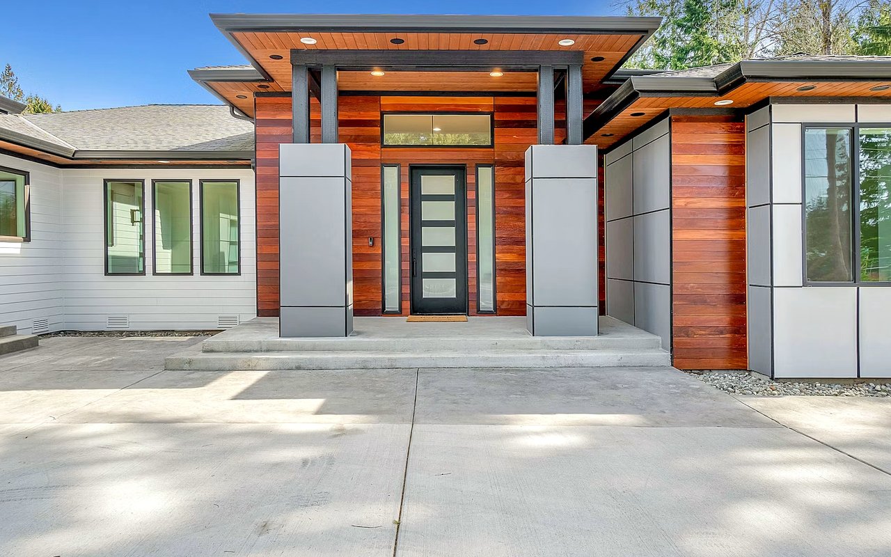
Paint isn’t just decoration — it shapes how we experience space, light, and mood. A tone that flatters your home exterior or flooring may feel completely different once it’s on your walls.
What Paint Color Really Influences
- How much light a room reflects — affecting brightness and perceived size of the space.
- Emotional tone and vibe — soft neutrals feel calm, bold hues energize, cool blues soothe, warm beiges cozy.
- Consistency and flow — complementary tones between rooms create harmony and help buyers feel your home is thoughtfully designed.
- Perceived maintenance and care — fresh, well‑matched tones signal upkeep, which becomes a subtle selling point when you list.
Getting tone selection right from the start saves money, avoids repainting, and brings your home’s personality into harmony with its spaces.
Assess Light, Orientation, and Use Before Choosing a Tone
Before picking paint, consider how each room receives light, how you use it, and what mood suits it. These factors influence which tones will look best.
Key Factors to Evaluate in Each Room
- The room’s orientation: north‑facing rooms get cooler, indirect light; south and west rooms get warmer, brighter light.
- How you use the space: bedrooms may call for relaxation tones, while kitchens or home offices may benefit from crisp, energizing colors.
- Flooring, trim, and fixed surfaces: wood floors, stone counters, or white trim affect how paint is perceived.
- Seasonal light changes — especially relevant in Seattle, where daylight varies greatly across the year.
By assessing these before you start browsing swatches, you’ll avoid choosing colors that look great in a sample but feel off when applied.
How to Select Paint Tones for Different Types of Rooms
Different rooms serve different purposes — and paint should support that. Your choice sets the stage for how people feel and behave in each space.
Paint Tone Strategy Based on Room Function
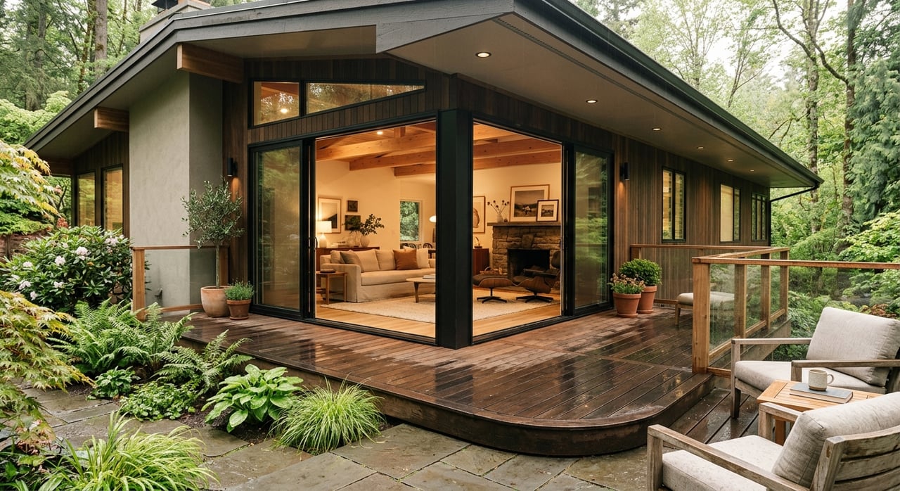
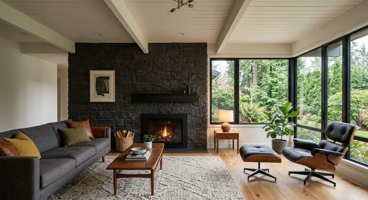
- Living rooms and family spaces: Soft neutrals, light greys, or warm off‑whites create open, welcoming spaces and reflect natural light well.
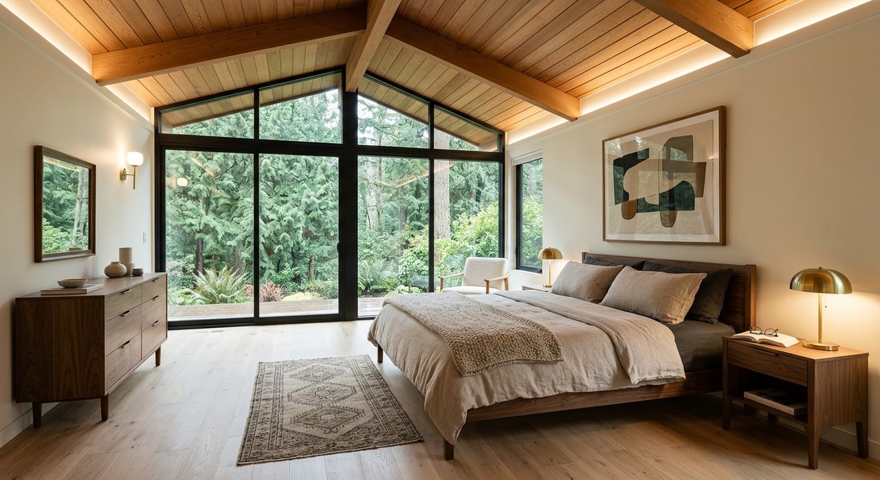
- Bedrooms: Muted tones — soft blues, warm greys, gentle greiges — encourage relaxation without overpowering.
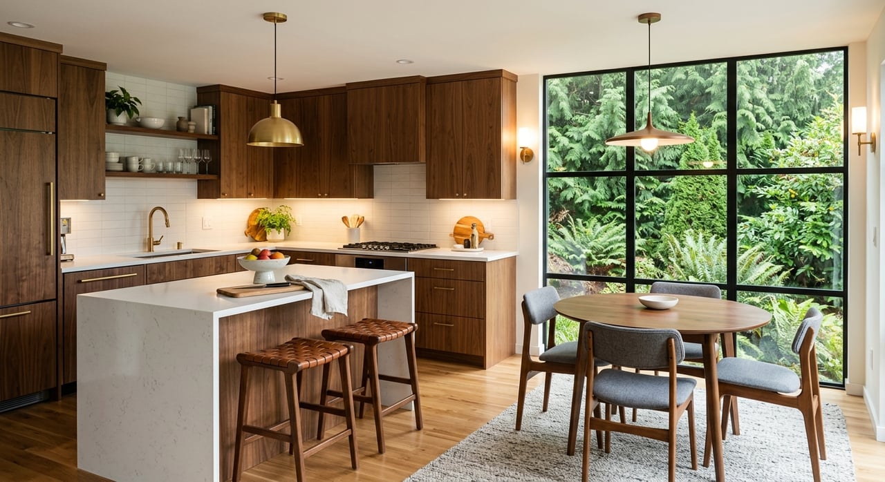
- Kitchens and dining areas: Crisp, clean tones like light beige, greige, or gentle white highlight cabinets and surfaces; accent walls add warmth or interest.
- Bathrooms: Light, clean tones (cool whites, pale sea‑foam, soft greys) enhance brightness; accent trims or subtle contrasts add sophistication.
- Home offices or study spaces: Balanced neutrals with slightly warm undertones help focus — avoid colors that are too cool or too warm, which can be distracting.
Match tone to purpose and you can create spaces that feel intentional — appealing both to you now and to future buyers.
The Science of Undertones — Why What You See in a Swatch Isn’t What You Get
Two paints labeled “light grey” can look completely different once applied. Undertones and light behavior change the effect dramatically.
How Undertones and Lighting Affect Perception
- Warm vs cool undertones shift with orientation: a warm beige on a north wall may look cool and grey — while the same paint on a south wall may read yellowish.
- Natural vs artificial light alters color appearance: daylight reveals true undertones, while incandescent or LED lights can shift tone warmer or cooler.
- Nearby surfaces (floors, countertops, trim) reflect light back onto walls — their undertones influence how paint reads in the room.
- Room size influences perception: smaller spaces feel more intimate with slightly darker or warmer tones; large rooms may benefit from lighter, airier shades.
Understanding undertones and light behavior helps you avoid a repaint — and increases the likelihood you’ll choose a paint tone that stays appealing over time.
Practical Steps: Testing, Sampling, and Deciding Before You Commit
Once you narrow down potential colors, take time to test — painting swatches, observing light, and living with the tones before committing.
How to Test Paints Before Committing
- Paint large sample swatches (at least 2 ft × 2 ft) on multiple walls in the room — not small strips — to see how tone behaves in space.
- Observe swatches at different times: morning light, midday, evening with lamps — tones shift with light changes.
- Compare swatches against existing finishes (floors, trim, fabrics) to ensure harmony.
- Live with the samples for 48–72 hours; check how mood, perceived brightness, and contrast feel across different times of day.
This process helps you avoid buyer’s remorse — or buyer headaches — because what looks good in a store rarely equals what looks good on your walls.
How Choosing Paint Wisely Impacts Home Value and Market Appeal
Good paint choices aren’t just aesthetic — they influence perceived value, buyer impressions, and how quickly your home sells.
Why Paint Tone Strategy Matters for Resale
- Fresh, well‑chosen paint signals care and maintenance — which buyers interpret as fewer hidden surprises or deferred upkeep.
- Neutral, widely appealing tones increase buyer pool — bold or dated colors may turn off potential buyers needing to repaint.
- Consistent tones create flow — open floor plans and connected rooms feel cohesive if colors coordinate; jarring shifts can feel disjointed.
- Quality finishes and attention to light create photos and showings that feel bright, spacious, and move‑in ready — important for online listings and first impressions.
A paint job done right can be a low-cost upgrade that raises perceived value and reduces time on market.
FAQs
What if my home has lots of natural wood and warm tones — how do I pick paint to complement that?
Look for paint tones with warm undertones (soft greige, warm off‑white, light beige) rather than cool greys. Test swatches beside wood surfaces under natural light to ensure harmony instead of contrast.
Can a darker paint tone make a room feel cozy without shrinking it visually?
Yes — in larger rooms, a slightly deeper neutral (like warm greige, slate‑grey, or muted taupe) can add depth and coziness while preserving a sense of space, especially if ceilings and trims stay light.
Should I repaint before selling even if the current paint is in good condition?
If existing colors are neutral, fresh, and light-enhancing, repainting may not be necessary. But if tones are dated, bold, or absorb light, a fresh, neutral coat can significantly improve buyer appeal with minimal cost.
Reach Out to Mel Parsons Today
If you’re unsure which paint tones suit your rooms — or you want advice tailored to your Seattle home’s layout, lighting, and finishes — I’d be glad to help. I can walk you through color sampling, coordinate with professionals for quality paint and finish work, and advise on choices that will maximize aesthetic appeal and resale potential.
I’m
Mel Parsons. Let’s work together to make your home look its best — inside and out — so every room feels like it belongs, and your property shines when it goes on the market.